When I first developed Pain Logger, I found that it was easier to have two storyboards for the different devices as the UI's are very different. But with the addition of the iPhone 6 plus and size classes in iOS 8, it seems converting to one storyboard will help reduce a lot of redundant code.
For example, for most view controllers I have a base class that extends UIViewController and a subclass for each of the two devices. So in the appropriate storyboard for each view controller I set it to use the device specific class. But if I could use only one storyboard and remove different views for different size classes then I would only need the base view controller.
So I started my investigation into how to add/remove a view for different size classes. I quickly ran across this document from Apple which basically explains how to do it.
So this blog entry is based on that document and what I learned about using different views with different size classes in practice.
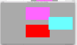
I started by creating a Universal, Single View app. Opening the storyboard showed the initial view in the Any/Any size class configuration. I set the view up so it contained three views that were laid out as follows:
My goal was to remove the cyan view and, to make it a little more real world, add a different view in a different place when running on an iPhone.
The purple and red views are attached to the top and bottom of the containing view respectively and centered horizontally.
The cyan view is attached to the right side of the container and centered vertically.
I also set constraints for the width and height of each of the views so it would be clearer where everything was moving to.
Next I switched to the Compact/Any size class. Here is where I ran into my first point of confusion. The size class picker shows these two options:
Notice the first one is for Compact/Any and the second one is for Compact/Regular. Also notice that Compact/Any says it is for iPhones in portrait OR landscape. This is important.
I pressed Command-Delete on the cyan view to uninstall it and added a green view in the center of the view controller. This resulted in this layout:
It is important to note the settings on the Attribute Inspector for the green view:
I read this to mean that for any compact width and any height the green view will be installed (shown) otherwise it won't be shown.
Next I ran this on the iPhone 6 simulator, and got this result (as expected):
Rotating it left I got this:
Which based on the constraints I set, is correct. It is interesting to note that if I rotate it to the left one more time (essentially putting the iPhone upside down) I get the same view as if I had just rotated the phone in the previous picture. I'm not sure I totally understand why.
Next I ran this on the iPhone 6 Plus simulator. In portrait mode I got the same results as before:
but in landscape mode I didn't:
Why is that? It is an iPhone and it is in landscape. Hmm, I figured it must have something to do with what size classes the view was installed in. So back to the storyboard. This time I switched it to Any/Compact:
Sure enough I got the layout I had in the iPhone 6 plus simulator. So I hit Command+Delete on the cyan view to uninstall it which resulted in in the following layout:
Notice that the description for this size class says that it is "for all compact height layouts (e.g. iPhones in landscape)" So when I run this on the iPhone simulator I expected to see that layout when in landscape, but that is not the case. Instead I got the original layout after rotating it:
I really don't understand why this is the case. It seems the iPhone always is considered to have a compact width no matter what it's orientation. But if I run this on the iPhone 6 Plus it does show the layout as shown above:
Next I selected the green view in the outline pane (since it wasn't showing in the storyboard directly) and went to the Attributes Inspector to install it. Here is the pertinent part of the Attributes Inspector after installing it:
What was interesting was after doing this, the view was not installed with it's constraints:
I believe the reason for this is I had added it as a view into a specific size class so when I originally added constraints to it they were installed only into that particular size class. At any rate I next added the same constraints as before to the view in this size class.
Now in landscape mode the iPhone 6 plus shows the same as the iPhone 6 did:
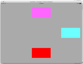
Finally to prove I had not messed up the iPad version I ran this on the iPad:
Here is portrait:
Here is landscape:
Exactly as I had intended.
So, in summary, here is what I learned:
- The Attributes Inspector is where you install/uninstall views. - I have been used to using the Size Inspector for all of my auto layout stuff. But when you are concerned with installed versus uninstalled views you have to go to the Attributes Inspector.
- If you know you are going to have different views for different size classes it is best to change to that size class in Interface Builder BEFORE you add the view. That way you can add the correct constraints for that size class only.
- An iPhone always seems to have a compact width size class regardless of it's orientation. The iPhone 6 Plus on the other hand does not. This one is confusing and probably bears more investigation.
As always, let me know if you have any comments or suggestions.


No comments:
Post a Comment