But with move to all Swift and particularly my current effort to rewrite Pain Logger in Swift I decided to take a look at how things have changed in the chart generation side of the world and particularly with a bent towards Swift.
I found ios-charts (https://github.com/danielgindi/ios-charts) and decided to take a look at it for my needs.
To do this I decided I would try to use it in an Xcode Playground so I could iterate on the different things I wanted to try rapidly.
I first started by downloading the project from github with the link provided above. Since I am targeting the latest version of Swift, I checked it out from the “swift-2.0” branch.
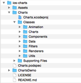
Next I created my playground in Xcode and added the package’s files. This was a little tricky as when you get the iso-charts package you will essentially get an XCode project with a structure that looks like this:

In a normal project where you were using iOS-charts you would either use CocoaPods or manually add the project as a dependent project. But with a playground this really isn’t possible. So what I ended up doing was coping all the files from the “Classes” folder (shown above) into the Sources folder of my playground.
To test this out I created a simple view and added a BarChartView to it like so:
import UIKit
import XCPlayground
let chartView = BarChartView()
chartView.bounds = CGRect(x: 0.0, y: 0.0, width: 375.0, height: 200.0)
chartView.center = CGPoint(x: 375.0/2.0, y: 200.0/2.0)
chartView.noDataText ="You need to provide data"
let containerView = UIView(frame: CGRect(x: 0.0, y: 0.0, width: 375.0, height: 200.0))
containerView.backgroundColor = UIColor.grayColor()
containerView.addSubview(chartView)
XCPShowView("Container View", view: containerView)
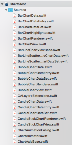
At this point the playground could still not find the ios-charts code so, I ended up moving the class files out of their individual folders and placed them all at the root of the Sources folder for the playground. The first part of this looks as follows:
This change got it working.

Now I was ready to try some things out.
To meet the requirements for Pain Logger I need a line graph where I can plot multiple data. The y -axis needs to run from 0 to 10 and the x-axis needs to be a date range. Additionally, for a new feature I am adding in the next version, I need to be able to call out specific data points. All of these needs to be presented in an aesthetically pleasing way.
So I embarked on an effort to see how close I could get.
My first effort was just to get a line chart showing. To do this I changed the chartView from a BarChartView to a LineChartView and added the following code.
func getEntryArray(dataPoints:[String], values:[Double]) -> [ChartDataEntry] {
var entries = [ChartDataEntry]()
for i in 0..<dataPoints.count {
let entry = ChartDataEntry(value: values[i], xIndex: i)
entries.append(entry)
}
return entries
}
let values1:[Double] = [0, 3, 2, 6, 5, 7, 2]
let values2:[Double] = [2, 4, 1, 1, 0, 2, 2, 4, 4, 4]
let range1 = ["Aug 1, 2015", "Aug 2, 2015", "Aug 4, 2015", "Aug 5, 2015", "Aug 6, 2015", "Aug 8, 2015", "Aug 15, 2015"]
let range2 = ["Aug 1, 2015", "Aug 3, 2015", "Aug 4, 2015", "Aug 8, 2015", "Aug 9, 2015", "Aug 10, 2015", "Aug 11, 2015", "Aug 13, 2015", "Aug 14, 2015", "Aug 18, 2015"]
var dataEntries1 = getEntryArray(range1, values: values1)
var dataEntries2 = getEntryArray(range2, values: values2)
// Get and configure the line chart data set
let lineChartDataSet = LineChartDataSet(yVals: dataEntries1, label: "Y")
lineChartDataSet.fillColor = UIColor.redColor()
lineChartDataSet.drawCirclesEnabled = false
lineChartDataSet.drawFilledEnabled = false
lineChartDataSet.drawCubicEnabled = false
lineChartDataSet.drawVerticalHighlightIndicatorEnabled = true
lineChartDataSet.lineWidth = 2.0
lineChartDataSet.valueTextColor = UIColor.whiteColor()
let lineChartData = LineChartData(xVals: values1, dataSet: lineChartDataSet)
chartView.data = lineChartData
chartView.backgroundColor = UIColor.blackColor()
chartView.drawGridBackgroundEnabled = false
chartView.drawBordersEnabled = false
chartView.legend.enabled = false
chartView.rightAxis.enabled = false
chartView.leftAxis.labelTextColor = UIColor.whiteColor()
chartView.leftAxis.startAtZeroEnabled = false
Finally I configured the line chart data set and the line chart view itself.
This resulted in the following view.

At this point I have a single line graph showing, but it’s not close to the result I am looking for.
After looking at the documentation, it appears that I can only have a single line on a line chart. This is a problem. I need to explore the possibilities more but it appears right now I need to go look at other graph solutions. Rather than continue to iterate on this I think I will end this post here.
What I have shown is how to setup a playground to use iso-charts and I have shown how to use a few settings. Overall the package presents well and there are several other types of charts it can render, but right now it doesn’t look like it will support my basic requirements, so I am going to move on to another package.
Till next time.
Checkout https://www.codebeaulieu.com/59/Adding-multiple-lines-to-your-ios-chart-Line-Chart You need to have a data sets array and pass that in for multiple lines.
ReplyDeleteThanks Chris. I looked at the link and one of my questions is how to deal with missing data. For my use case, users enter data based on categories and dates. So they may enter a value on the first and 5th of the month for one category and the 3rd and 10th of the month for another category. So I need to graph the two categories together, but if I programmatically align the data by supplying the missing values, (as I see it) I have two choices. Either I enter 0 for a missing value or I enter the previous value. Neither of these work, as neither graph results represent the data the user actually entered. What I want to do is enter "nil" for the missing values and have that particular category "jump" to the next data point in it's dataset. I assumed it wasn't possible, but I will go back and check it out in light of the link you provided. Thanks for the input.
ReplyDelete